In 2020, I worked with Real Life Church in Rapid City, SD to design a new logo and full brand build-out.
*The designer, Kathryn Saffell, is not affiliated with the client, Real Life Church, and any political or religious beliefs, creeds, or views espoused by the client are not representative of the designer's views.
Below are the church's past logos. The first originated around the late 2000s when the church changed its name from Rapid City First Church of the Nazarene. The second originated in the late twenty-teens, which to my knowledge was designed by the pastor at the time. It is worth noting that while the church had a logo, there had not yet been a cohesive brand to speak of.

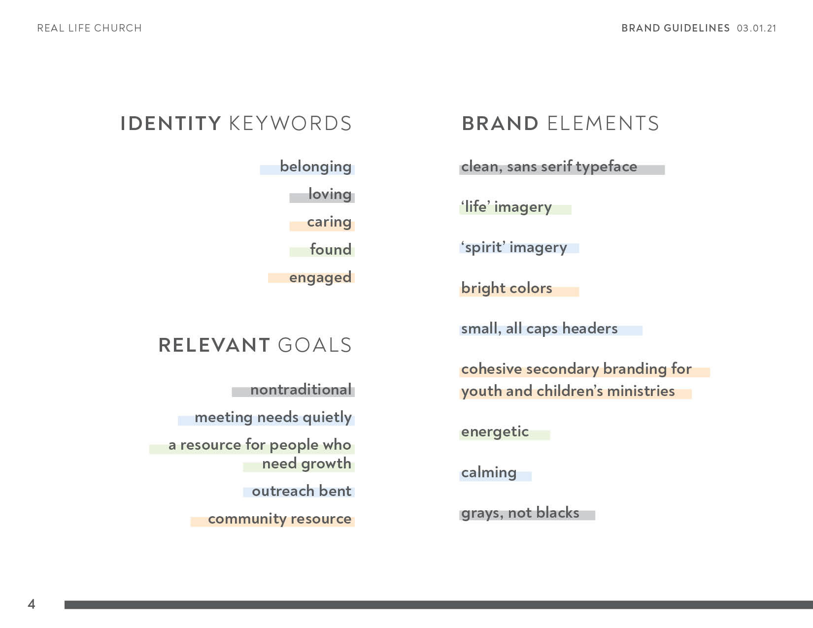
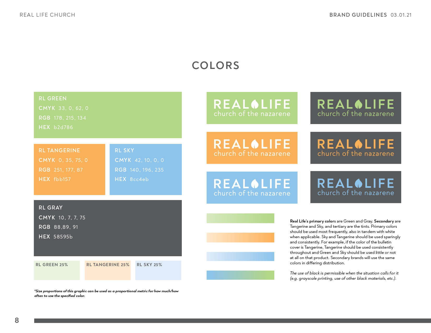
The branding process began with several meetings with church leadership to assess the church's brand identity, both current and aspirational. By identifying keywords and goals, we developed a visual language with which to build a brand. Three separate brands were developed and proposed, and two concepts merged to become the current imagery that blends the denomination's heavily spiritual focus with the congregation's conceptual leaning toward life and growth.


Since the organization had little to no experience working with a brand, I created the brand guidelines to be as explicit as possible. Below are pages from the brand guidelines outlining do's and don'ts regarding how to implement the brand in print and digital collateral, as the church has no in-house designers.

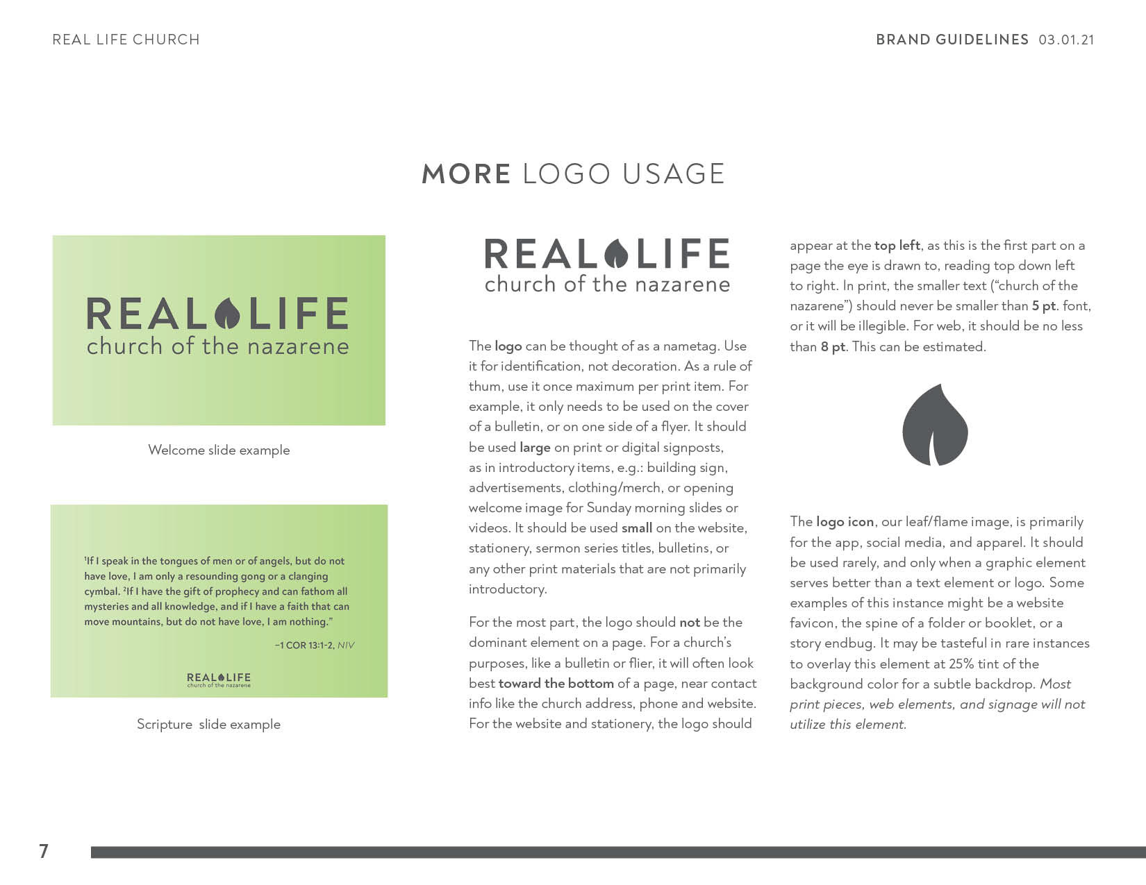
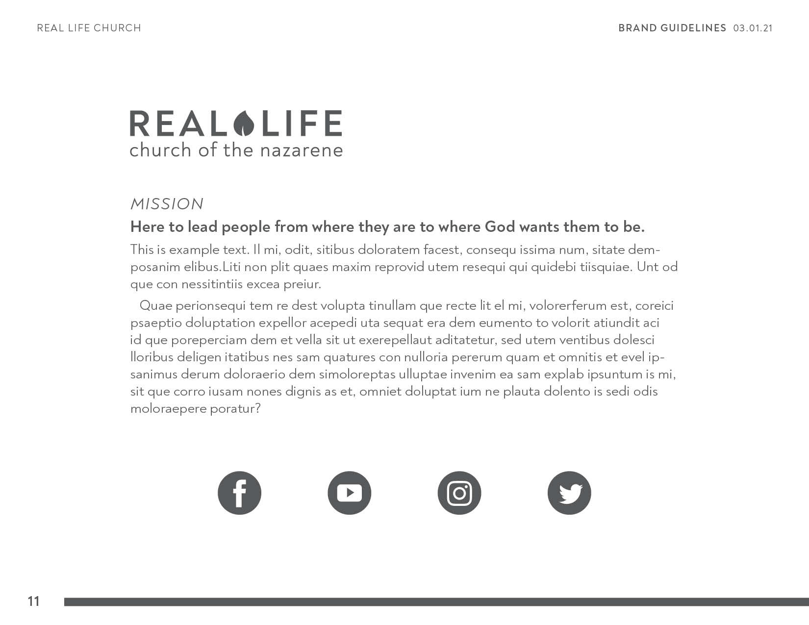
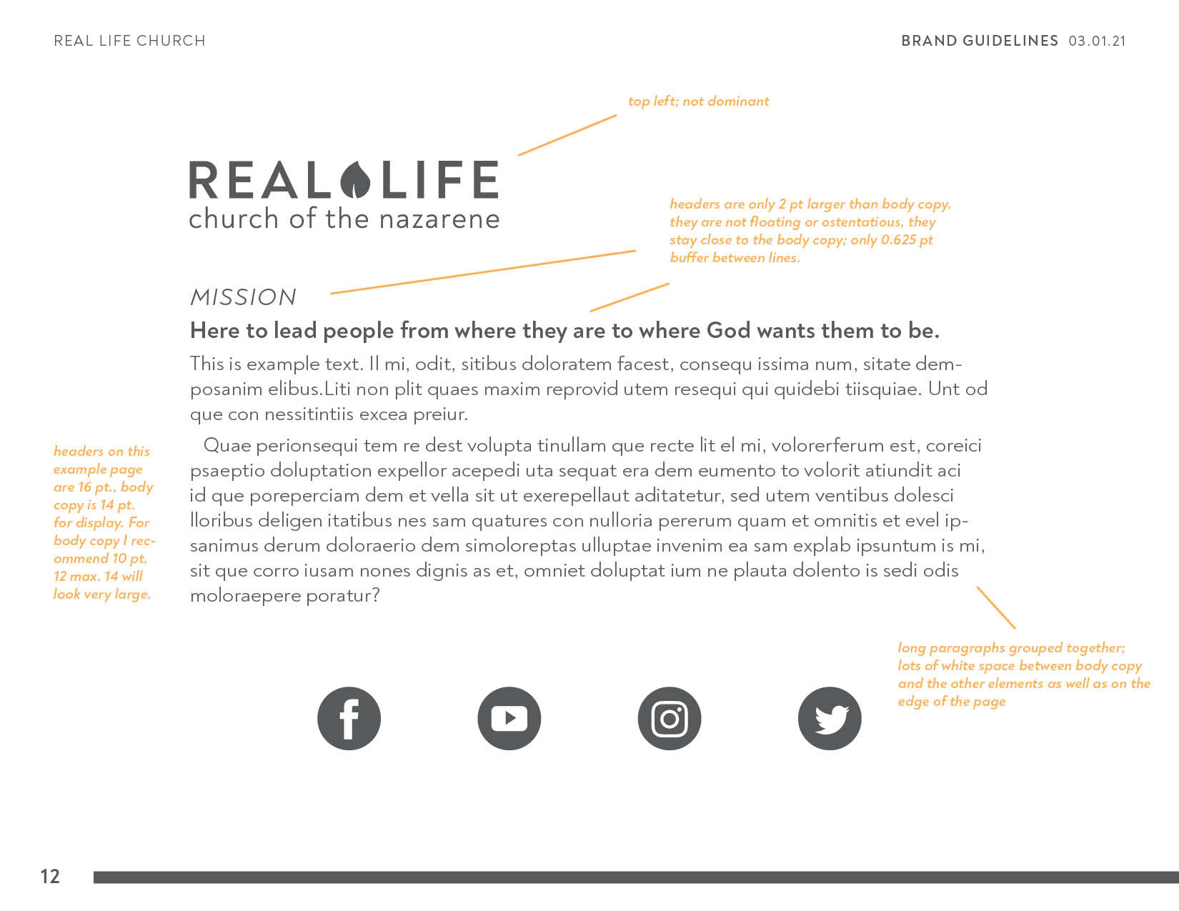
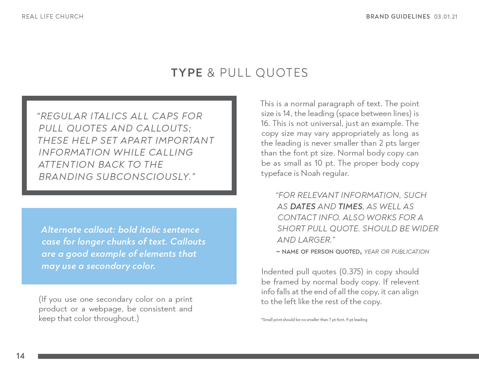
Included in the branding were some examples of how the branding could appear on a page, with tips on hierarchy, white space, and basic typography rules-of-thumb.

Deliverables included secondary brands for separate church ministries, namely the youth programs and small groups. The primary branding is at play in all the secondary brands, but each highlight a different visual attitude within the larger identity.
The Kids' Life brand uses all the brand colors, as children's programs should be bright, colorful, and inclusive. The least-used color is in fact gray, favoring color for copy, or even white with color as the background, as shown below. The logo is clean and legible so as to avoid a common error among children's ministries, but the logo icon is tilted playfully, taking the place of an apostrophe. The typeface headers are lowercase, to convey a relaxed friendliness.
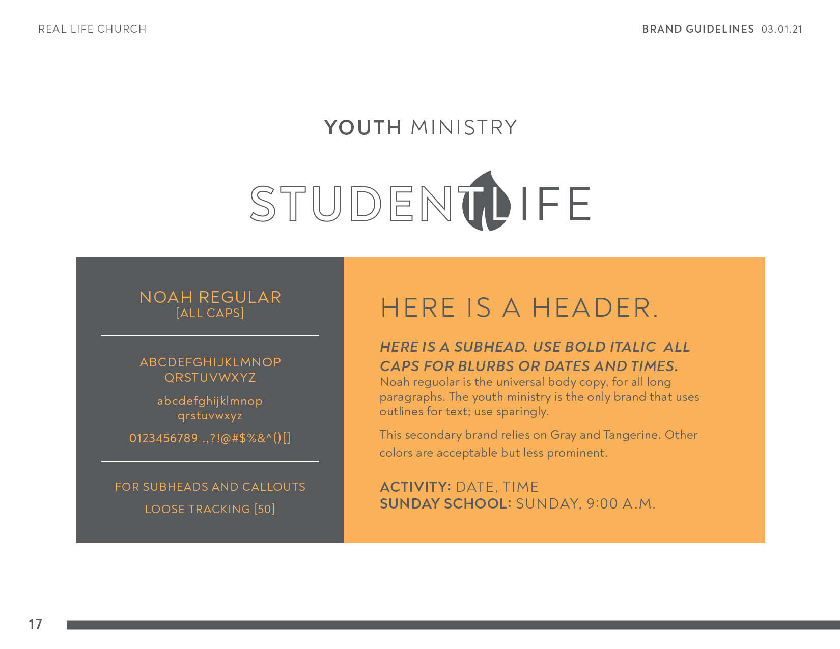
The Student Life ministry is for junior and senior high schoolers, and the Student Life brand reflects an edgier, bolder interpretation of the primary brand. The brand makes use of the secondary color, tangerine, to distance itself from the primary brand, which pairs with heavy use of gray, in contrast to the children's ministry. The typography makes frequent use of all-caps, once again for a bold tone in the copy.
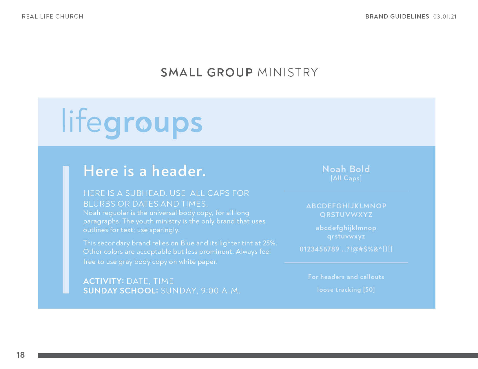
The LifeGroups logo is the most understated secondary logo. As an adult small group ministry, it is the least independent from the parent brand. The purpose of this ministry is increased social connection, so the brand utilizes blue, a soothing, friendly color favored by social media brands like Facebook and Twitter.