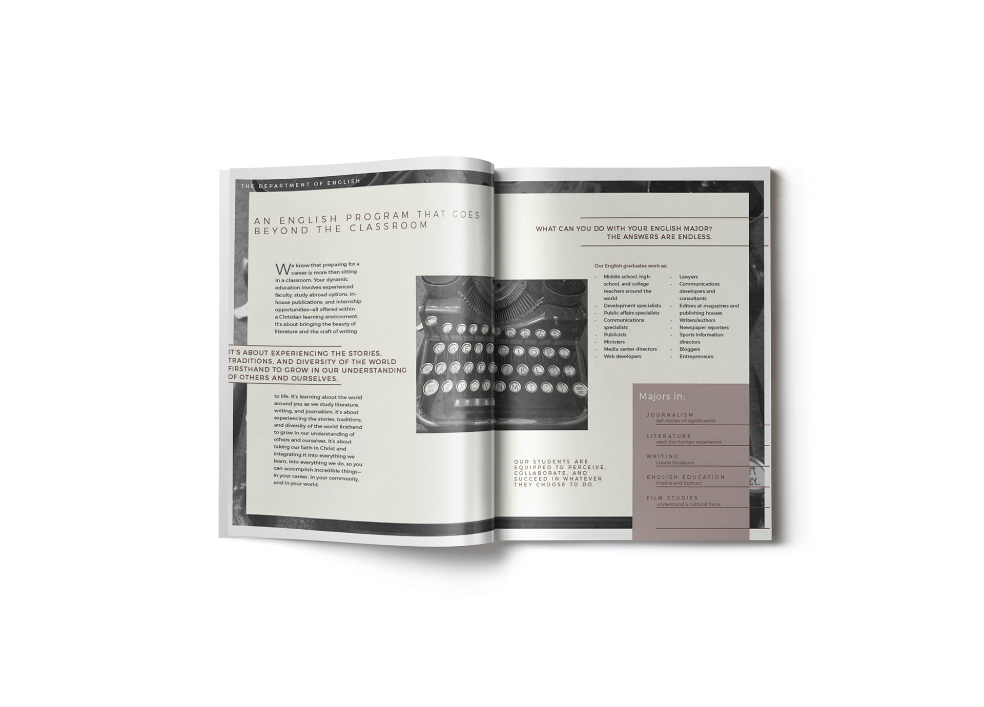
The challenge was fitting a large amount of information and text intuitively within one brochure.
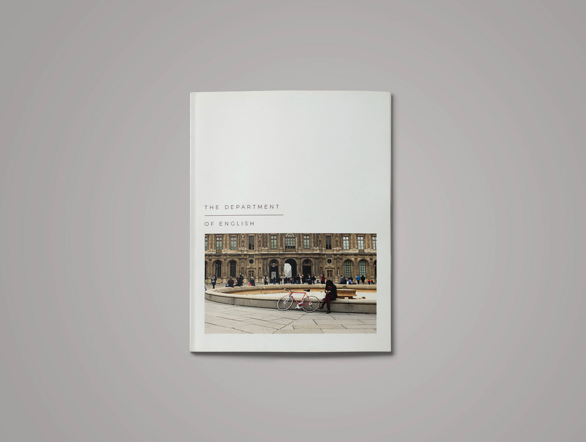
Another consideration was the mood of the entire project. English, as a department, has a versatile reputation, which make its visual language less obvious. The design might communicate a very professional, wordy, academic aesthetic, or it might take on a quaint, artsy, poetic aesthetic.
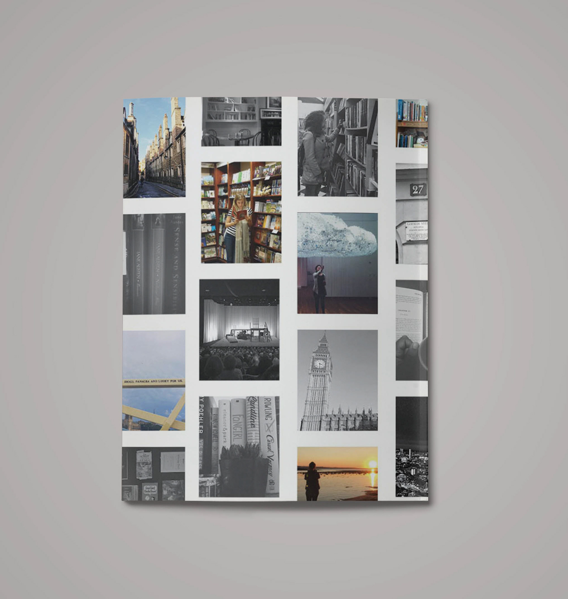
In my visual research, I began to focus on students who were actually in the department, and emulate them aesthetically instead. In doing that, I decided I needed to find a happy medium between academic and artsy in order to truly convey the truth of the department as it is at this particular university, and as it interacts with its students.