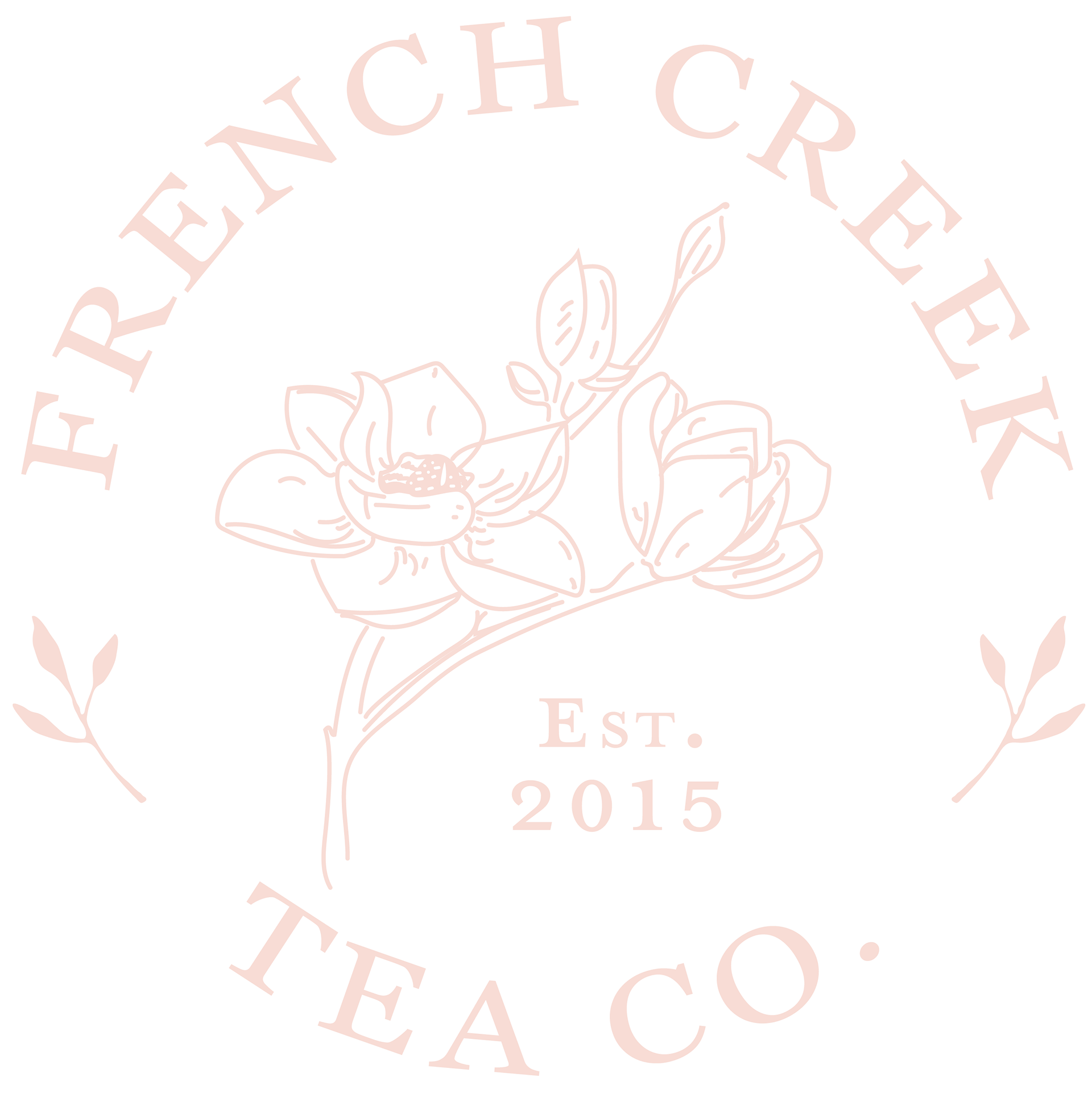
In 2020 client who had recently purchased a tea company asked me to redesign the brand. We had several meetings to discuss mood and palette, and after a few iterations of the logo, we decided to focus on the magnolia as a fixture in the logo, as it has special meaning to the client.
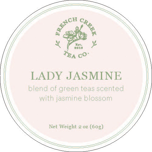
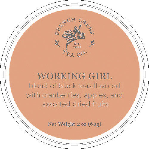
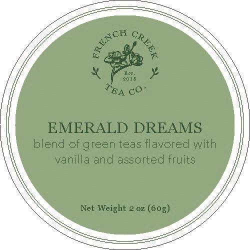
The tea is packaged loose leaf in blank packets, so I created individual labels to be made into stickers for the entire catalog of teas. I utilized the tertiary colors in the palette to add unique interest to each blend, echoing some of the more robust flavor tones visually in the color duos for each discreet label.
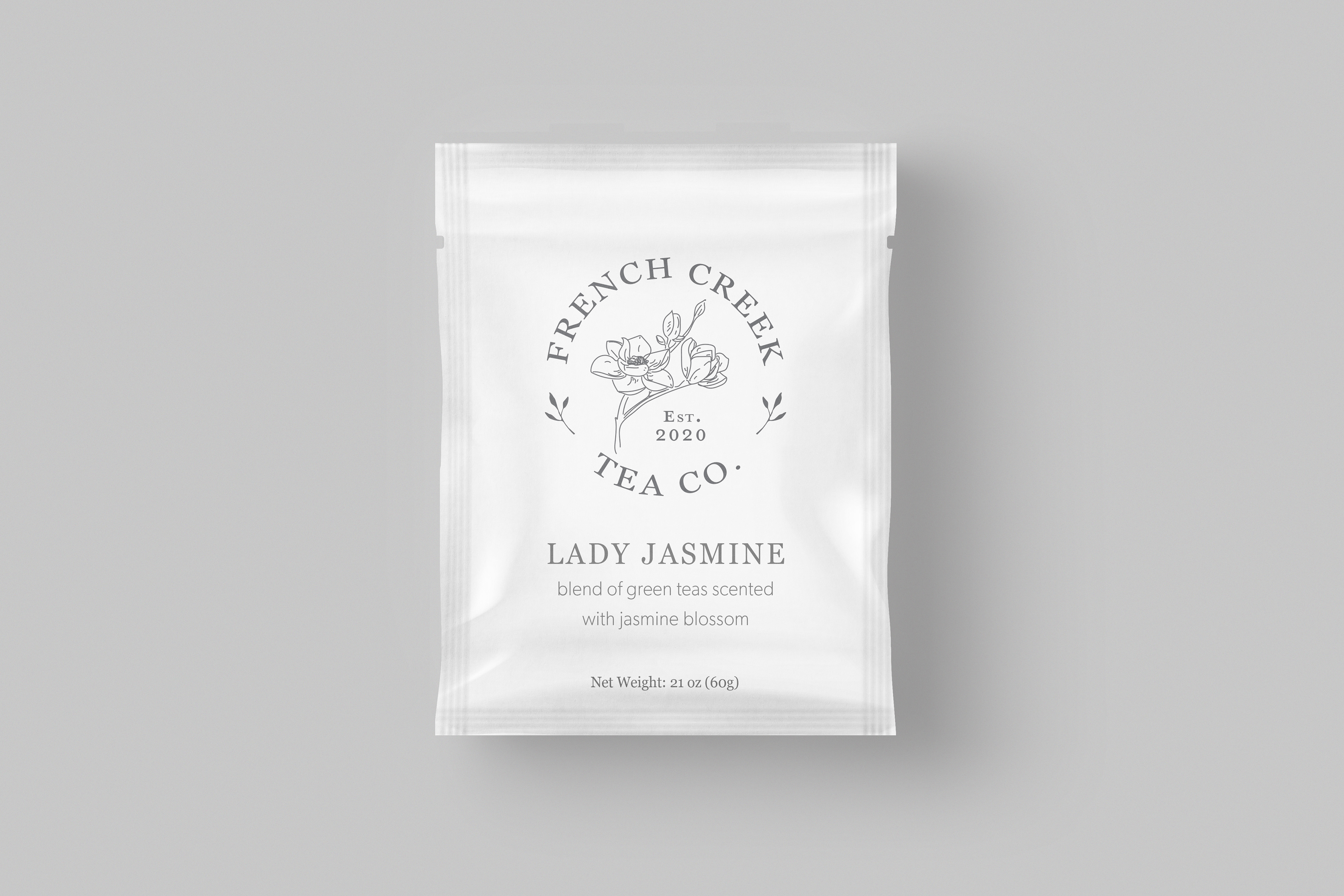
A mockup of a tea packet, created mid-process to give the client a visual idea of the application of the logo and font pairs.
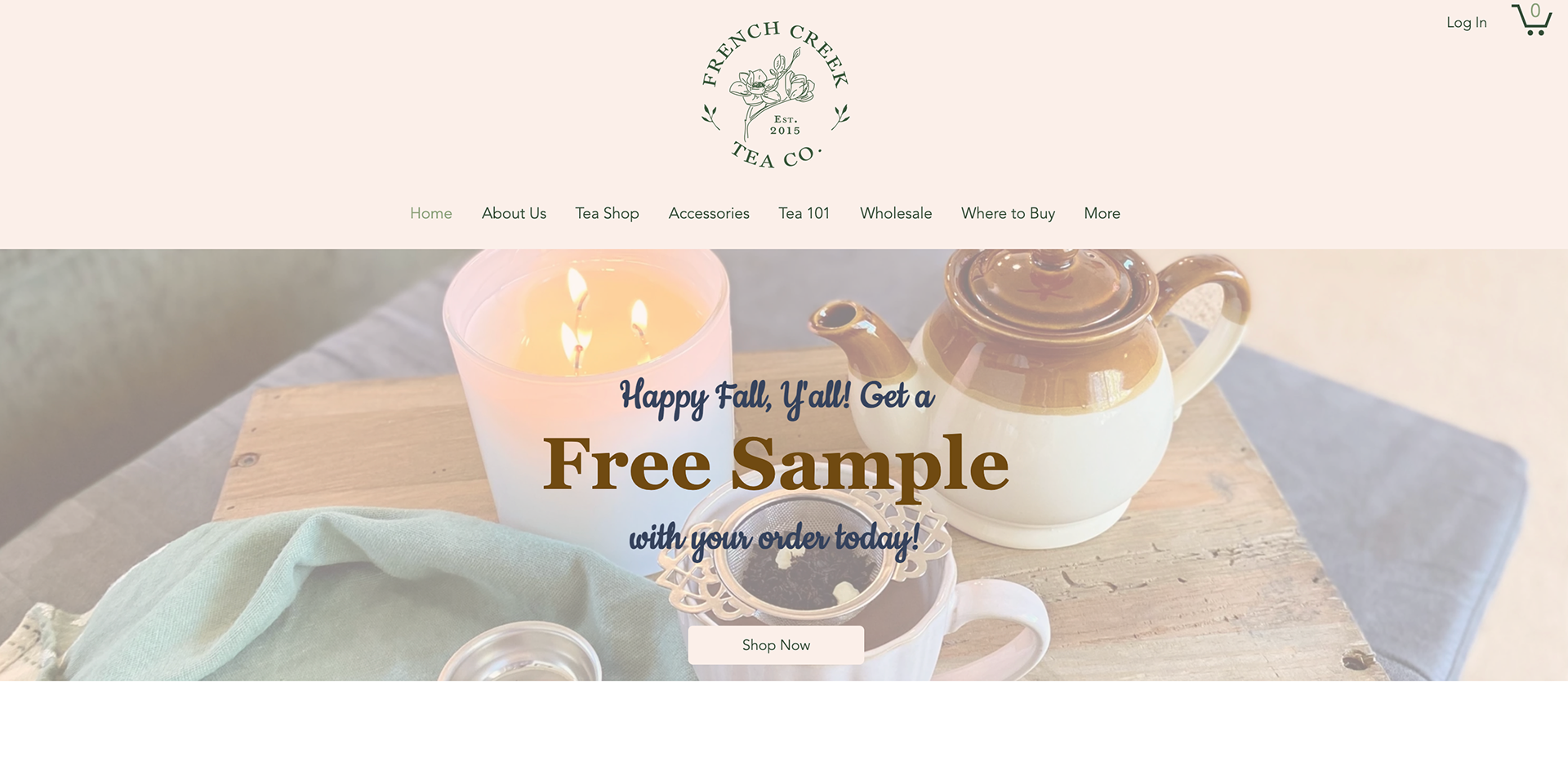
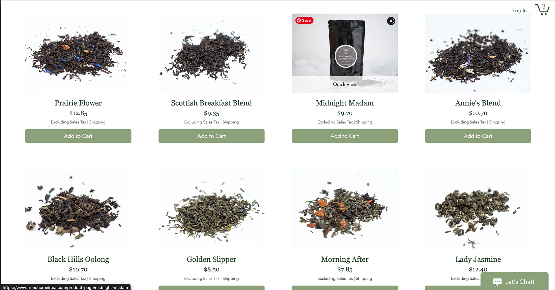
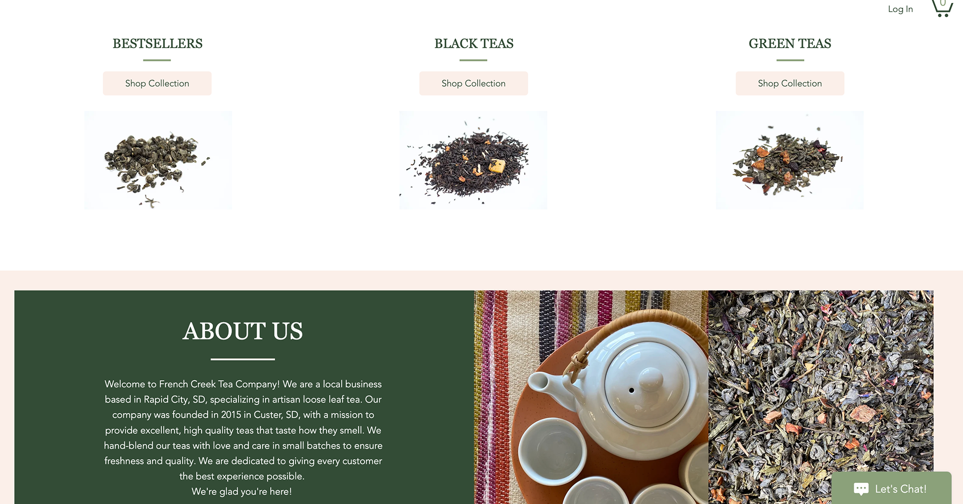
Screenshots of the client's current website, and how the brand is used practically.
Below you can see a preview of the labels used on the packaging.