This project was an experiment in designing for music. I started by picking a band I particularly enjoy. While it was hard to pick from hundreds of fantastic artists, I decided on Bear's Den because of their consistent sound and the feeling of nostalgia that tends to awaken when I listen to them. Next, I picked an arbitrary venue and date, an artist or two that might open or collaborate with them, and set to work collecting imagery.
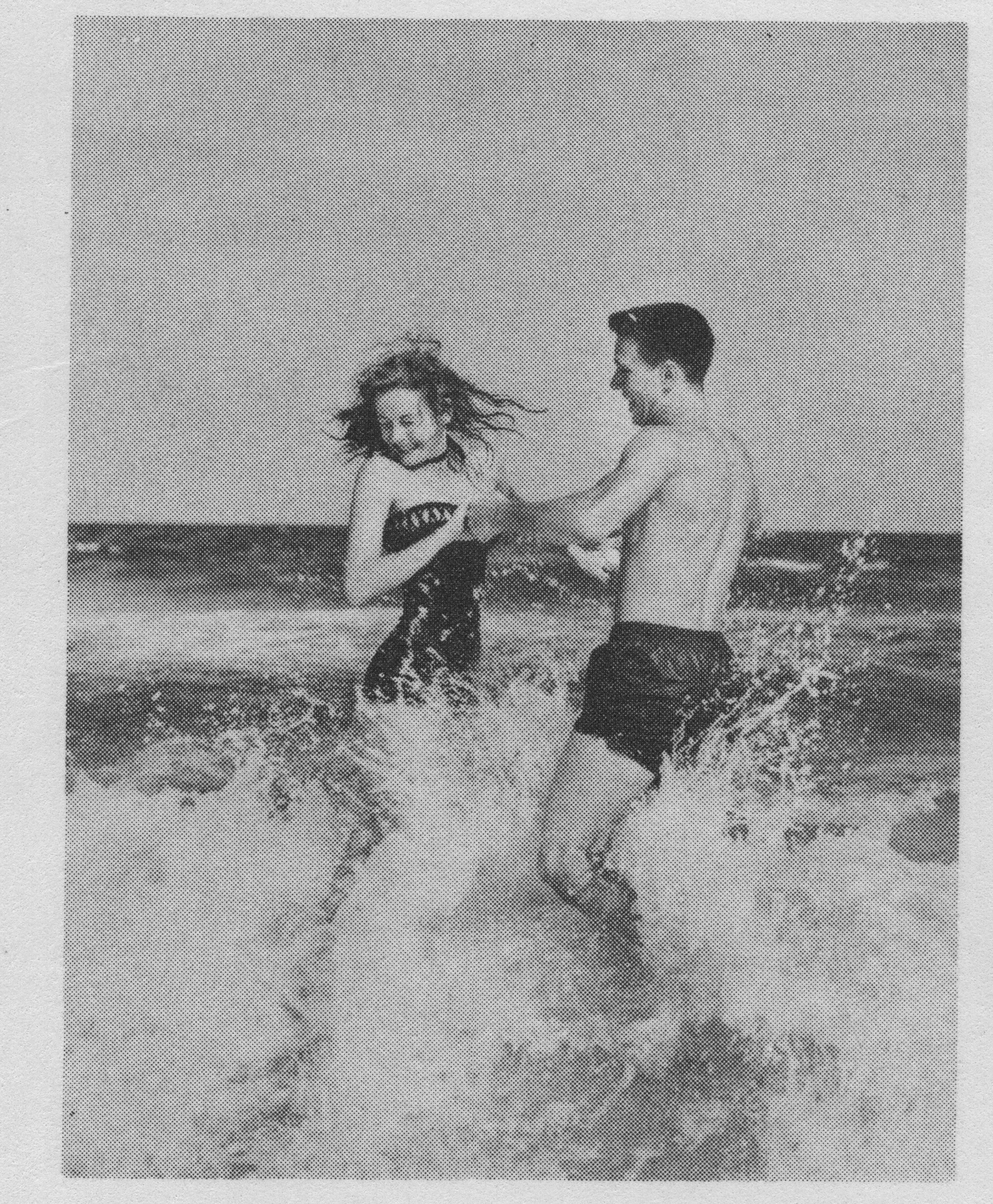
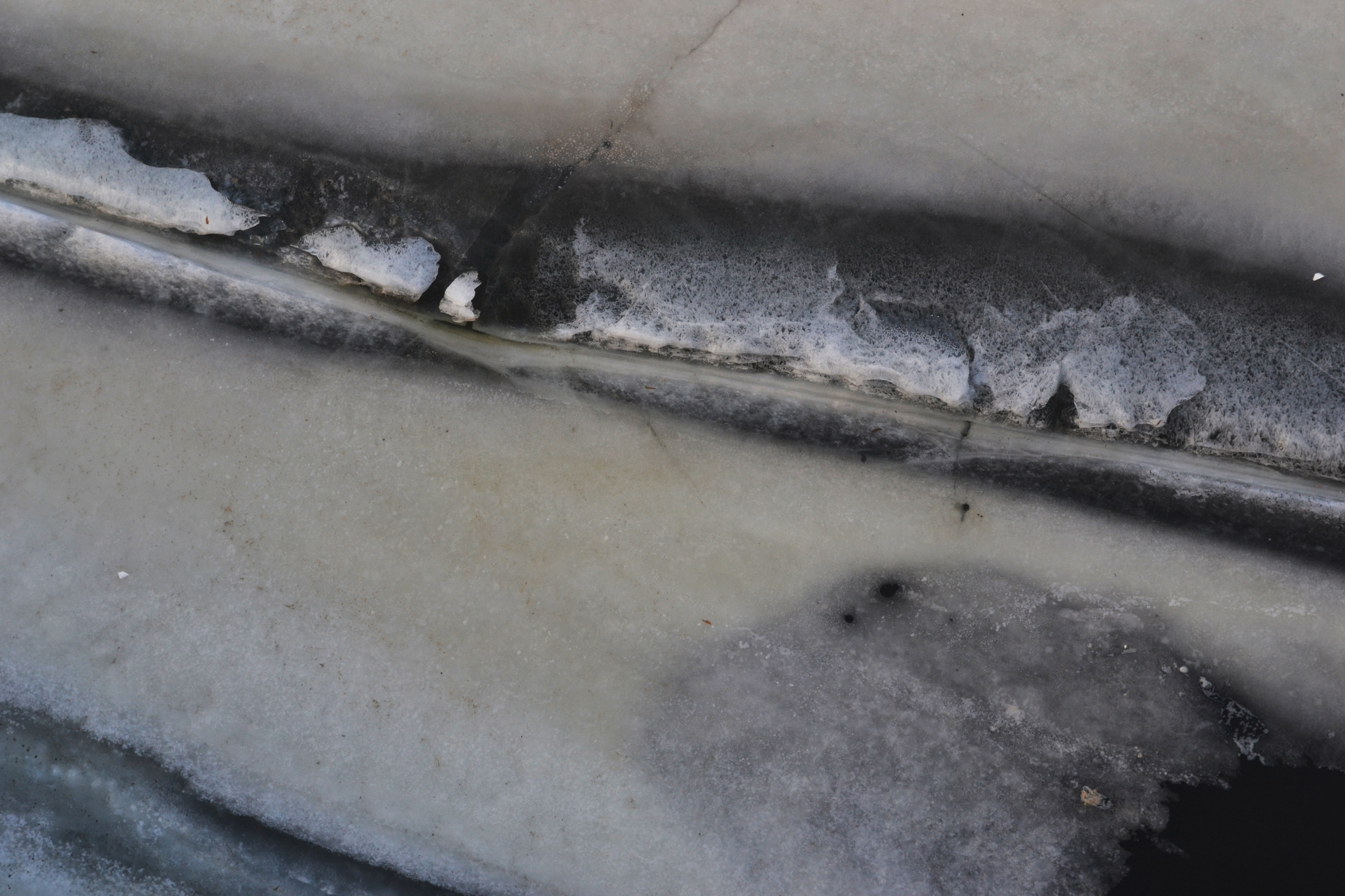
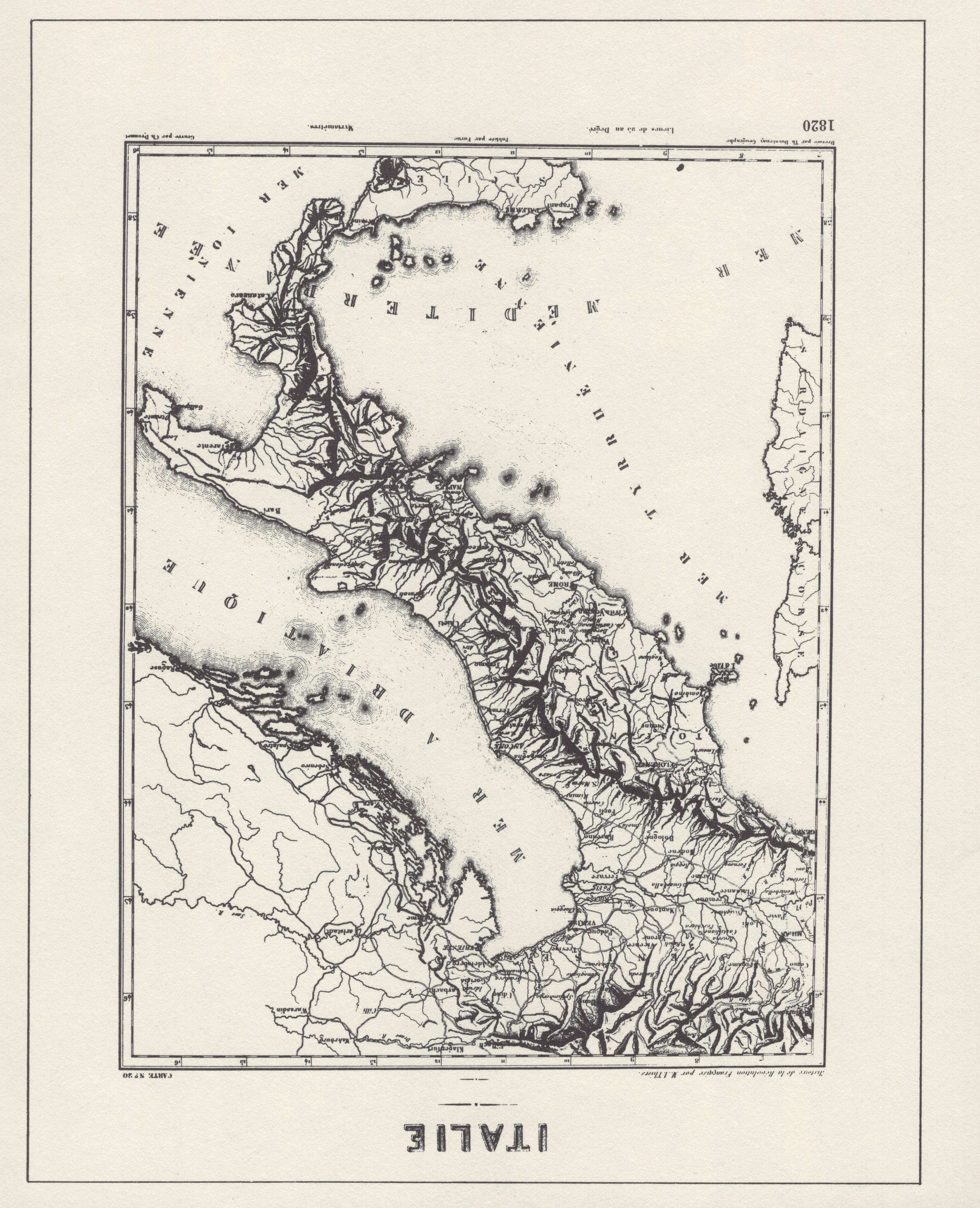
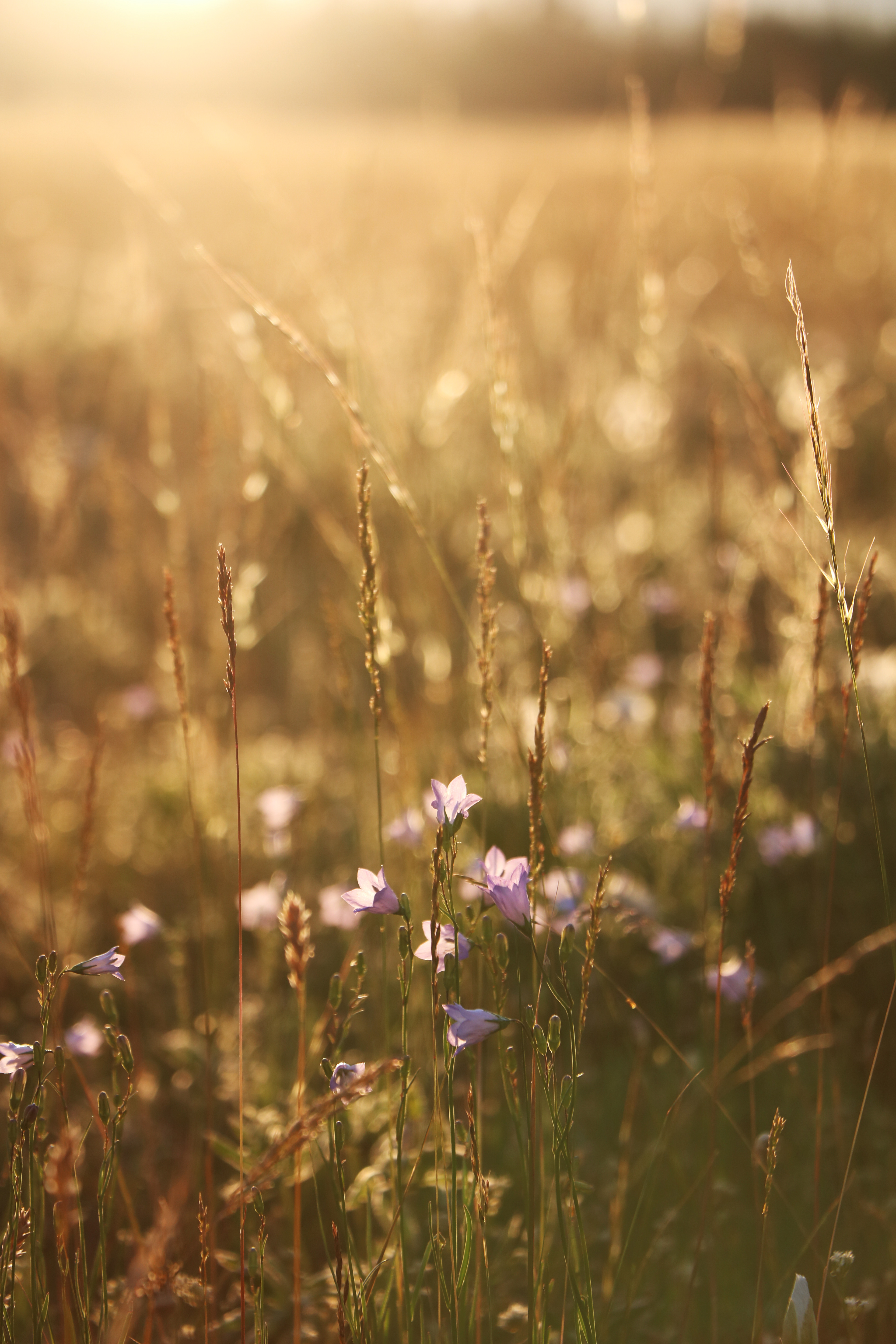

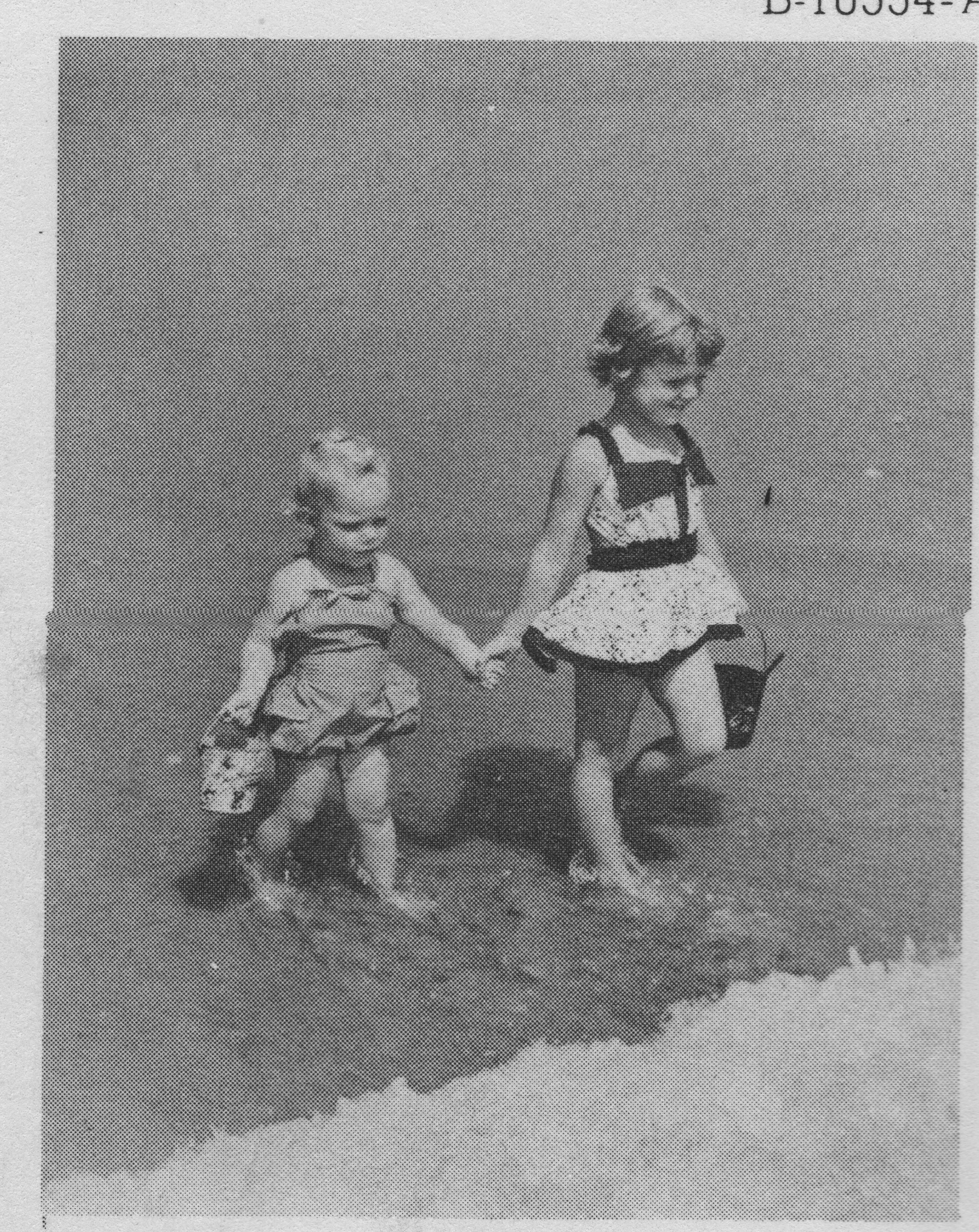
Between an assortment of my own stock textures and backgrounds, image searches, and scans from vintage magazines, I had an array to choose from.
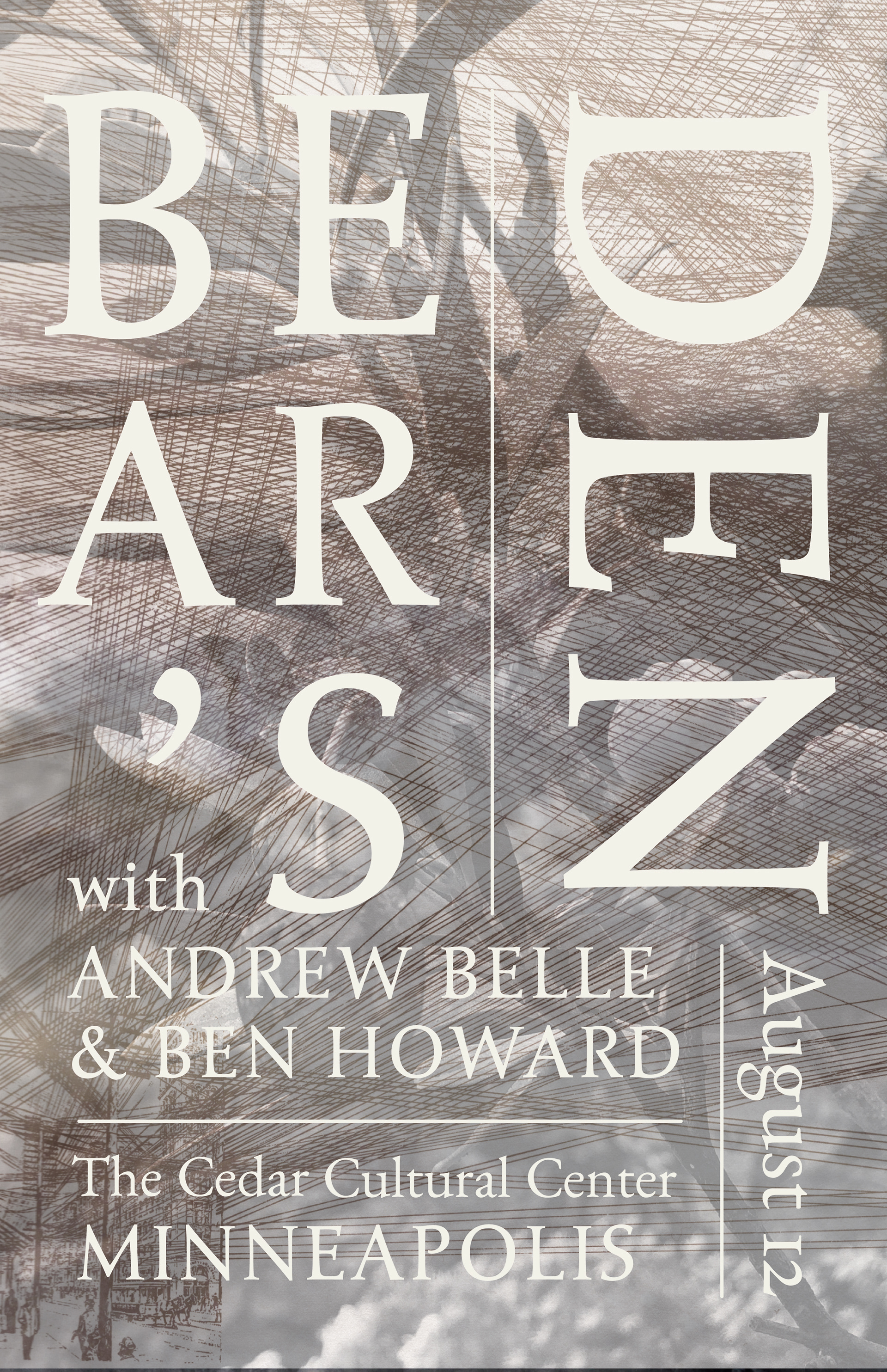
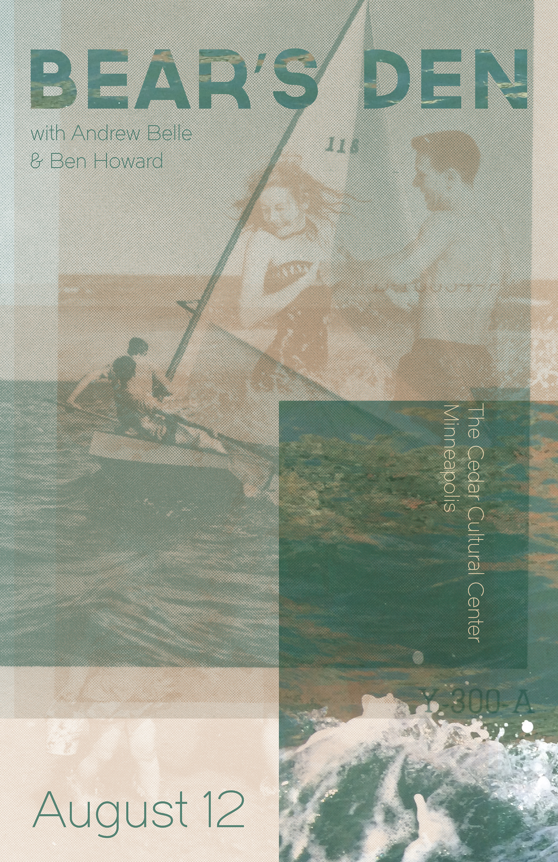
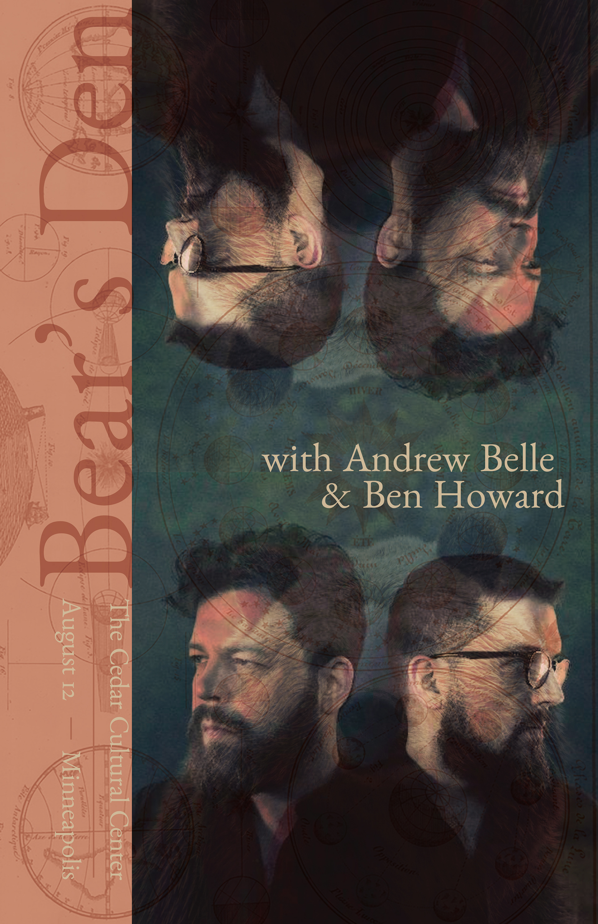
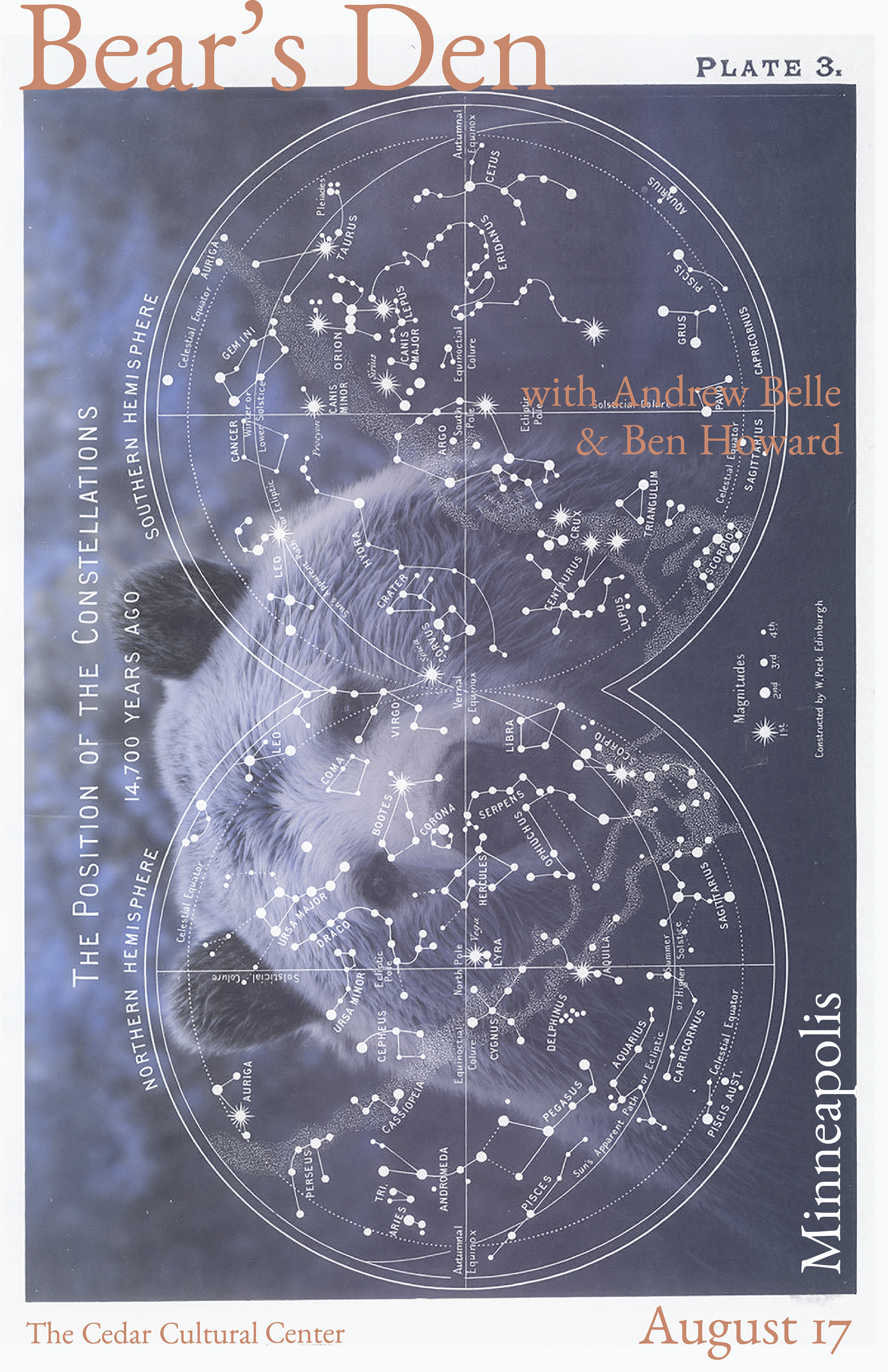
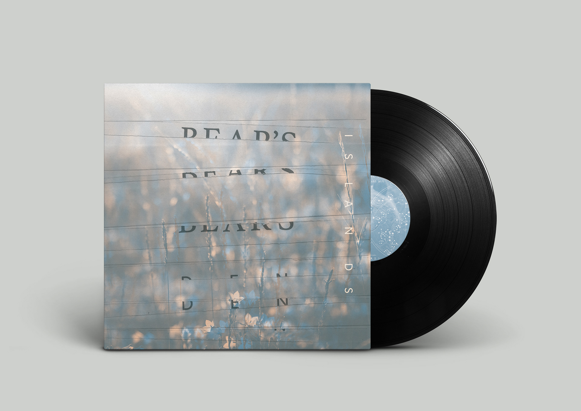
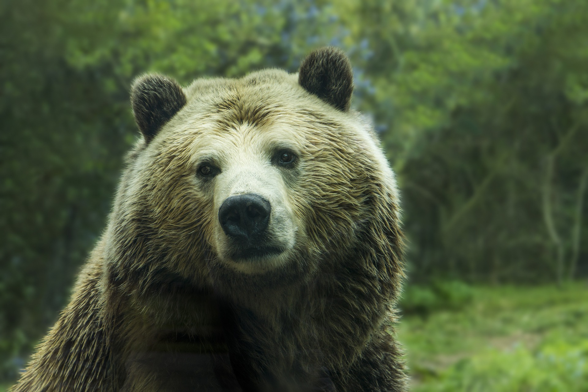
For all the drafts I ended up going for a layered collage effect to convey nostalgia visually. This came off a little heavy-handed in one of the drafts that ended up taking a vintage feel that overpowered the moodier part of sentiment. I also tried being relatively specific, using a photo of an olive branch on one as a reference to Italy from one of their songs, or overlapping an image of a bear onto several drafts. Interesting as the images turned out, I disliked how explicit they were and started leaning toward what I considered the vaguest–and perhaps simplest–image.
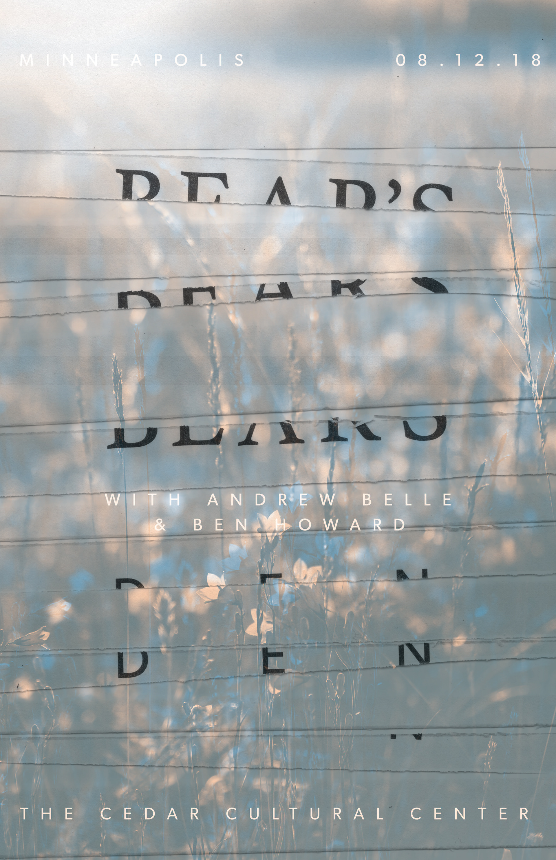
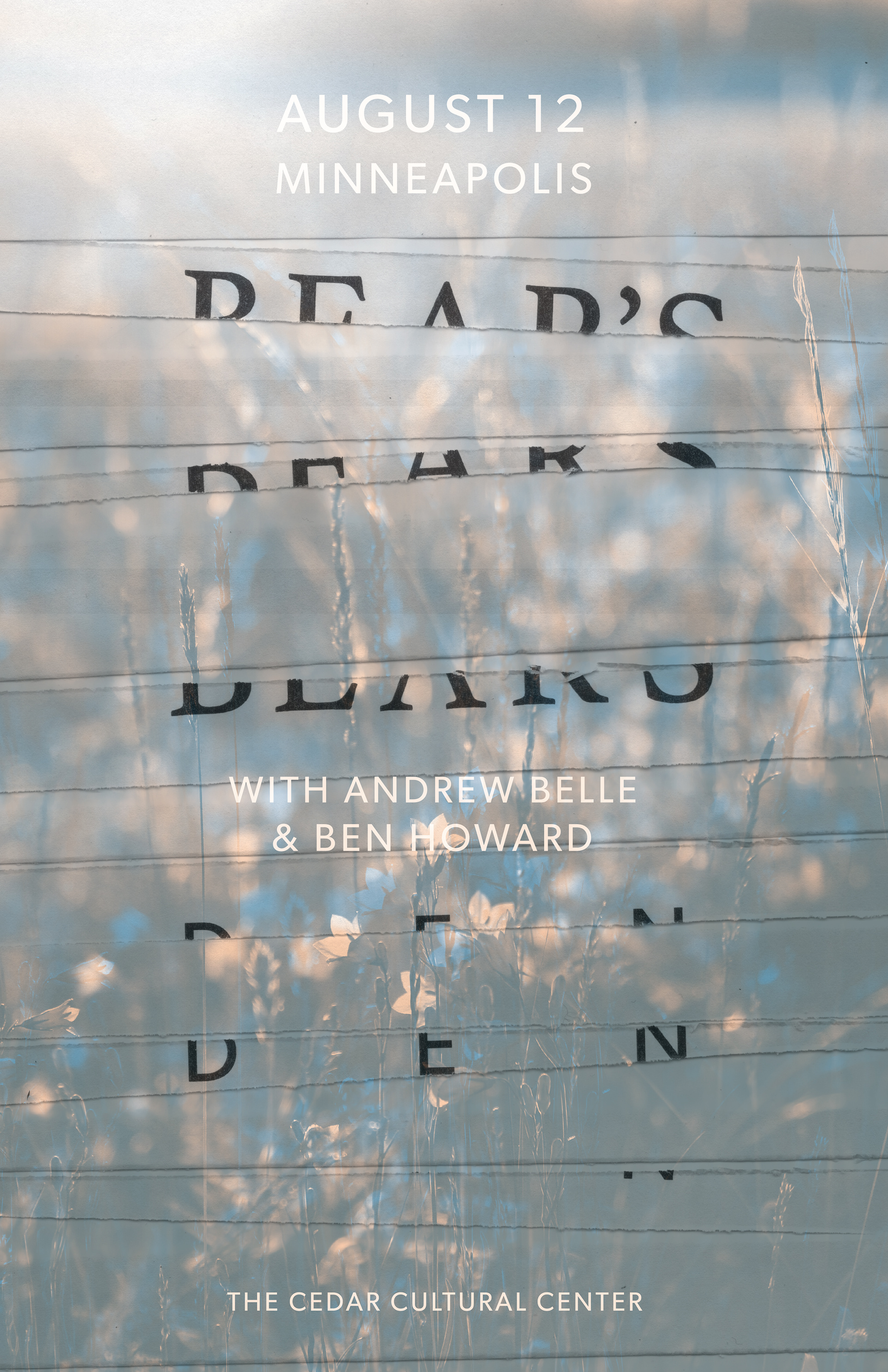
I initially created the torn text as a typographical experiment which turned out nicely, so I kept it. I was also pleased with the ethereal effect of the overlapping images, the hazy colors, and the subtle reference to 3D technology. After nailing down the draft I wanted, I adjusted the typography until I was satisfied and had myself a final poster image.
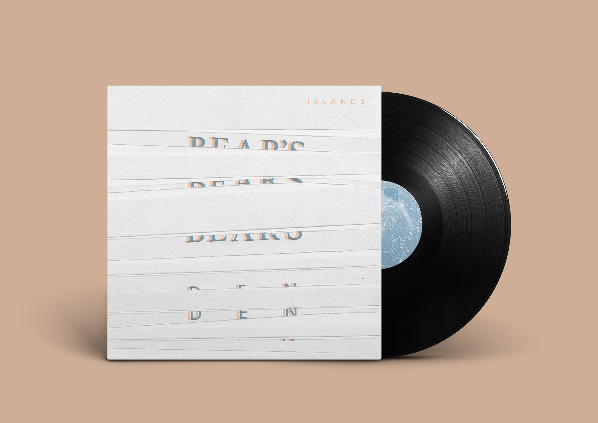
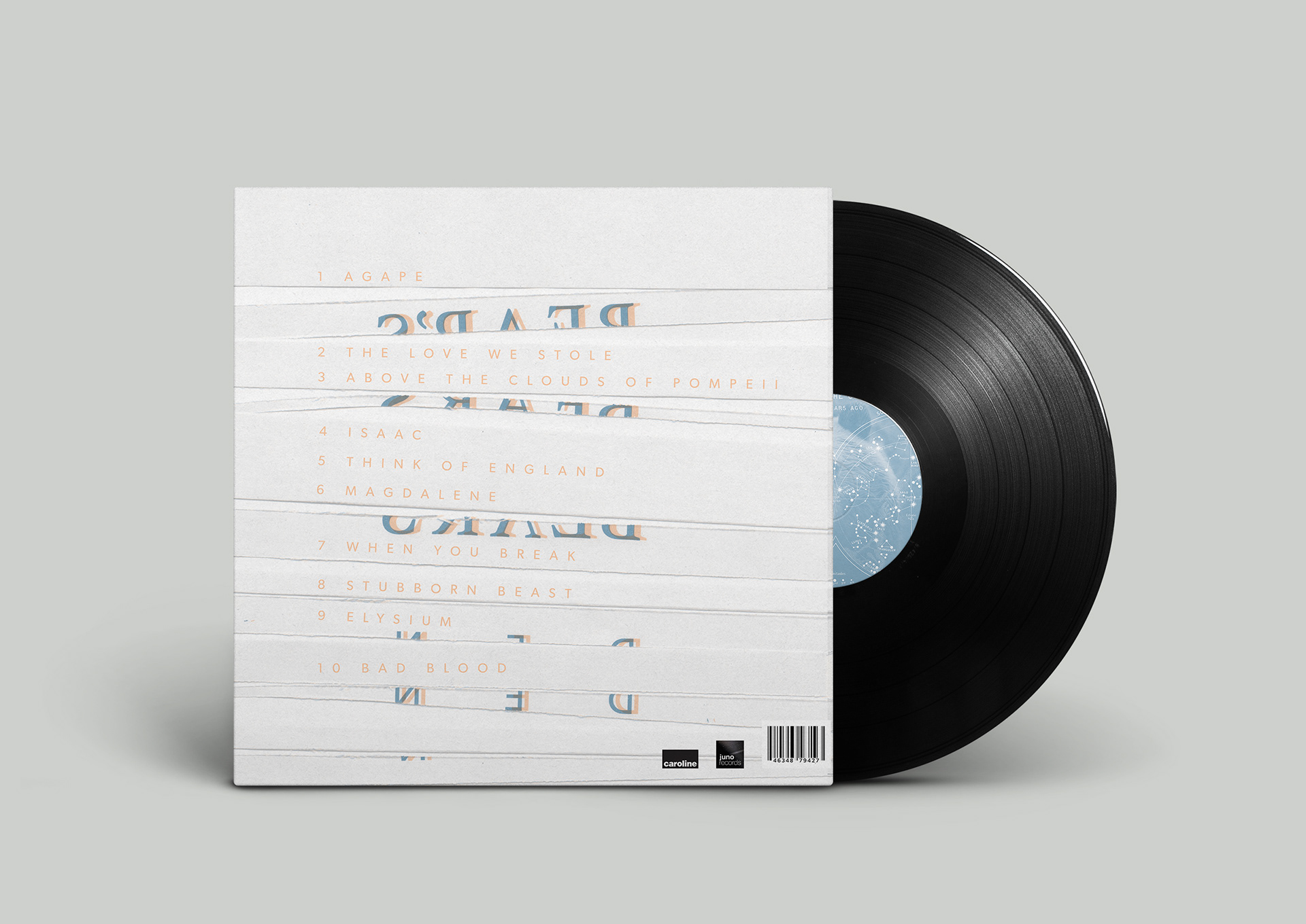
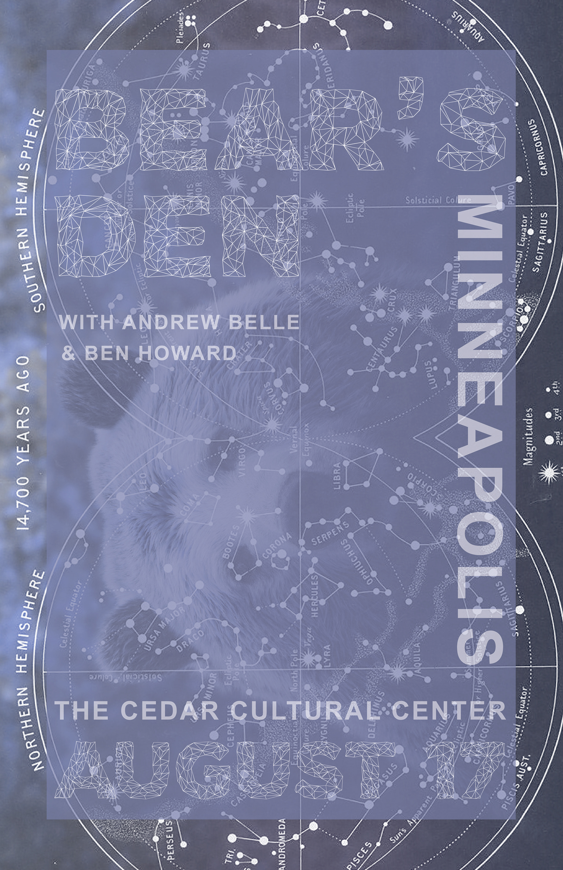
After the poster was finished, the idea was to work backward to make an actual album. I thought it might be a good idea to diversify them and pare down the stylization to just the text while still maintaining a reference to the colors and the 3D concept. Additionally, I added some of my conceptualization from my other poster drafts to the center of the record; the bear in the constellation seemed kitschy out of context, and for some reason that really drew me much more for the additional record art than the poster design.
After receiving some feedback, I realized that the album cover looked slightly mummified, so I returned it to its original poster design for the final iteration. I decided to leave that design for the back cover, both for a little diversity and for legibility's sake.